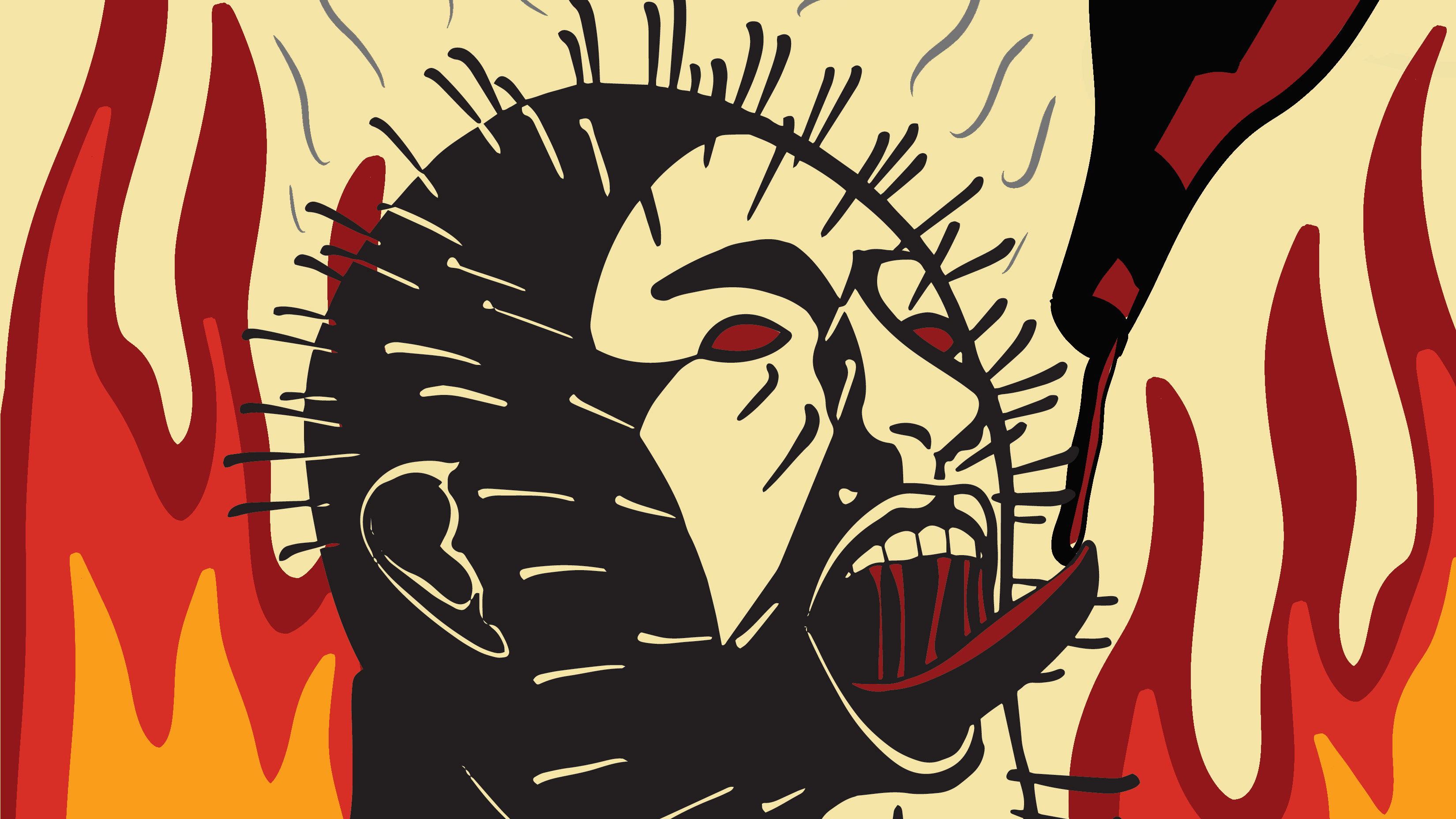
Milwaukee United is a Project that consisted of making a soccer team brand. first thing to starting a design for a sport team is to know their community. I researched all about the third ward in Milwaukee and found information that they had a fire in 1892. This fire was major impact on the third ward community. They lost more than 400 buildings. However the community was able to over come this and rebuild.
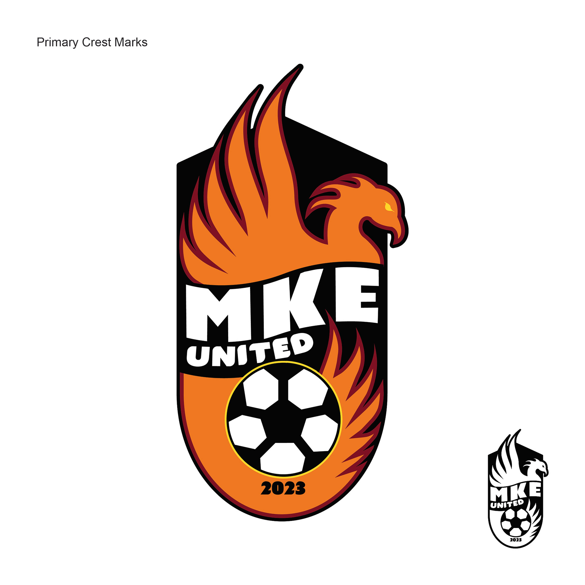
I chose to use the phoenix as a mascot because of its ability to come back from ashes. This is showing that the community always comes back. I went for a more traditional crest with a ribbon to display to text to symbolize the history. The colors are blazing orange, red embers, charring black, flare white, and combustion yellow. These were all chosen to symbolize the fire.
Final Crest
Tight Sketches of best 3
The first sketch was playing with the phoenix going around the soccer ball with the MKE being flames as well. This design was thoughtful but the phoenix and MKE was hard to read.
The second design was inspiration from the fire logo. However this design was too modern to be used for my more tradition research.


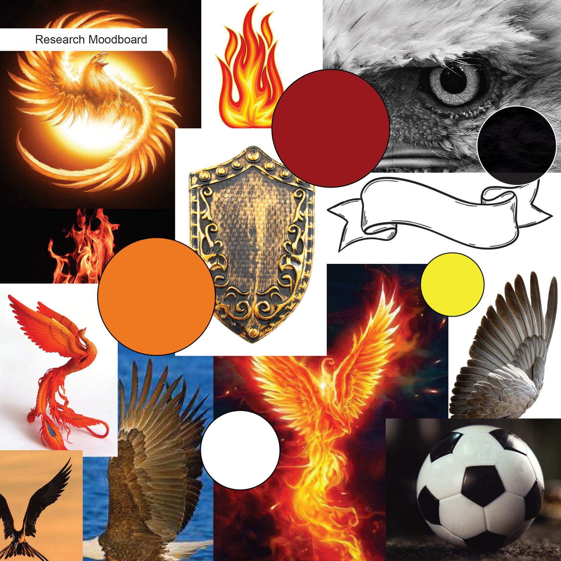
Rough Sketches and Moodboard

Sketches for Soccer Kit, Primary, Secondary, and Alternate
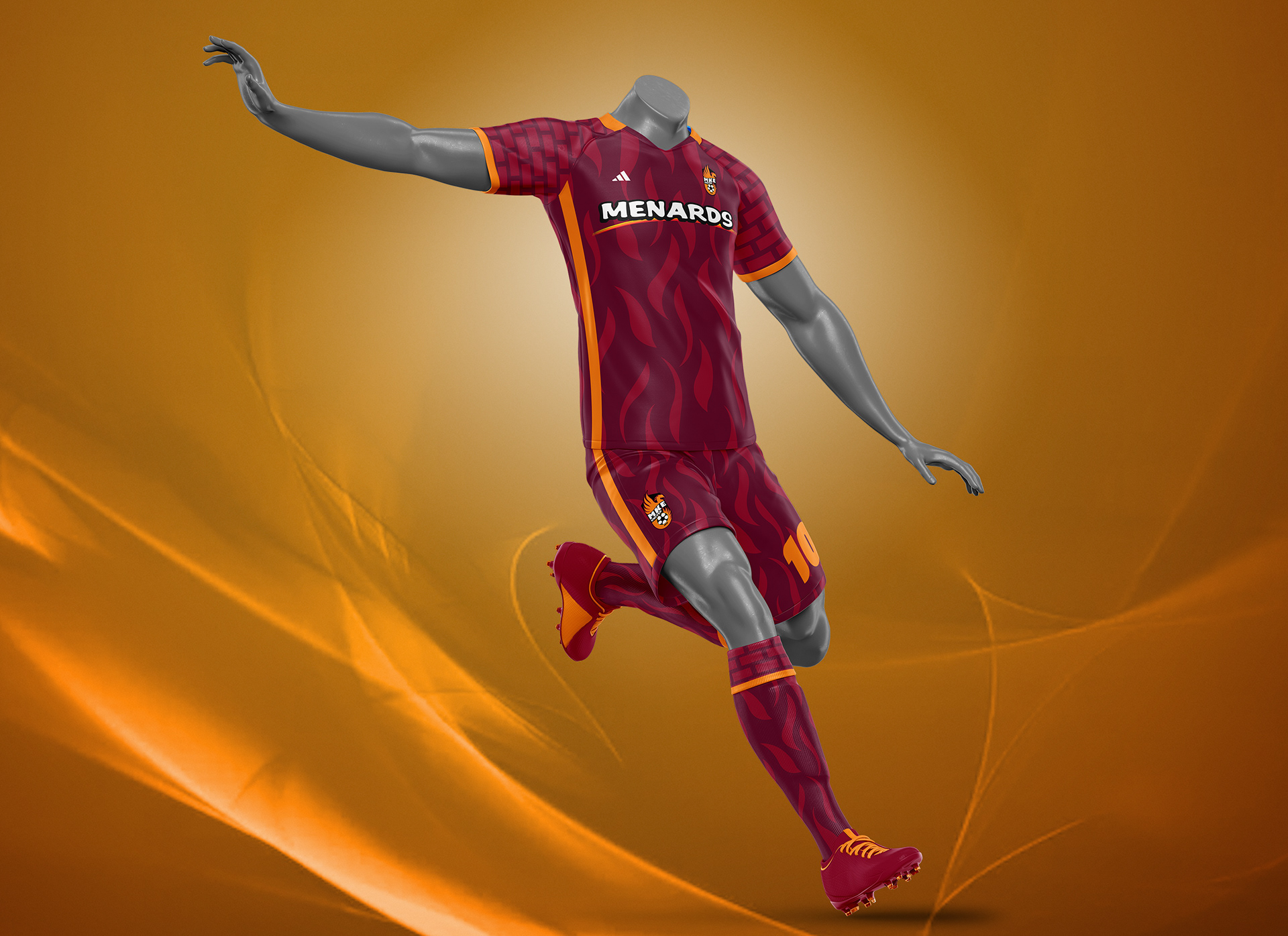
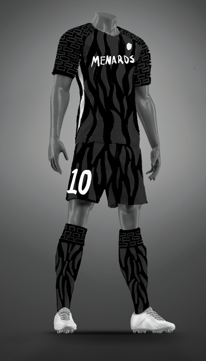
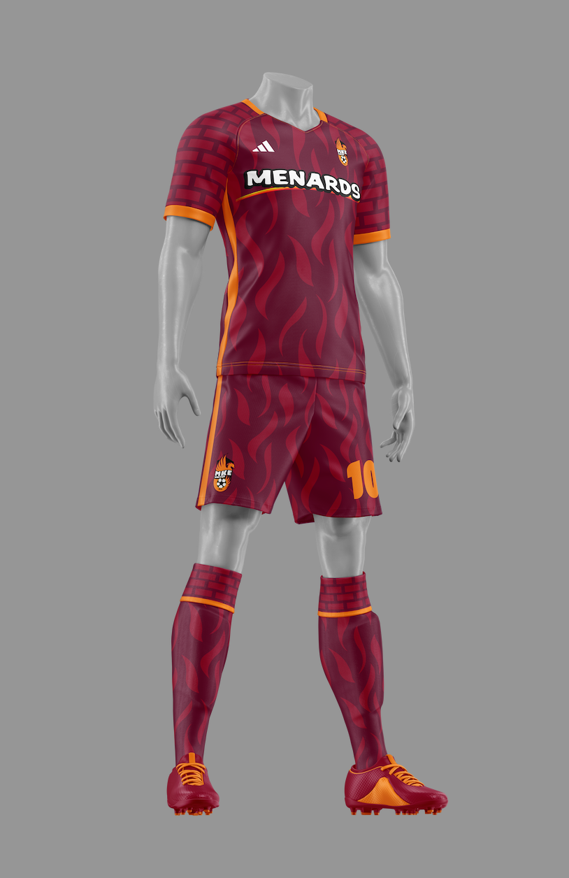
For the first Kit design I wanted to have this one as my primary kit. This would be the dark Kit and it would have a flame pattern on the front of the shirt and down to the shorts and socks. The shoulder, and inside of socks would be brick patterns to symbolize the buildings.
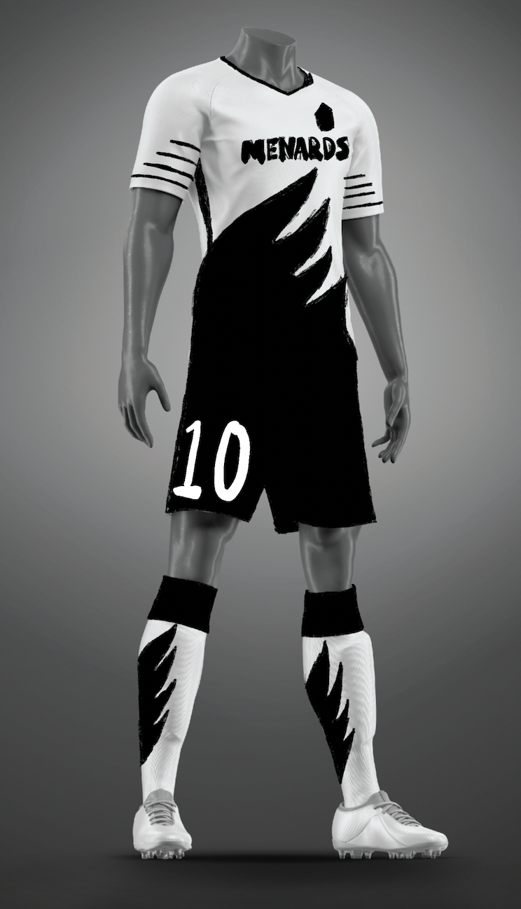
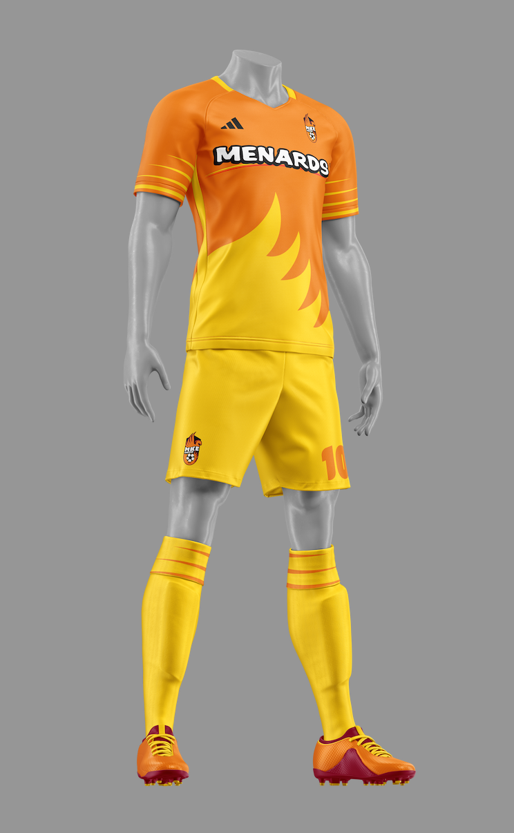
The secondary Kit would be the light Kit. I chose to use the wings as the front of the shit and have the color lead down the shorts as well. The line work on the sleeves are to symbolize the wind of the wings.
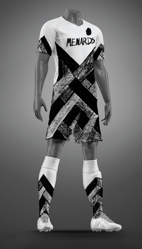
The alternate Kit is based on the gallery's in Milwaukee. I chose to do a paint pattern mixed with rectangles. These would be an abstract version of architecture and paint.
Color added to sketches
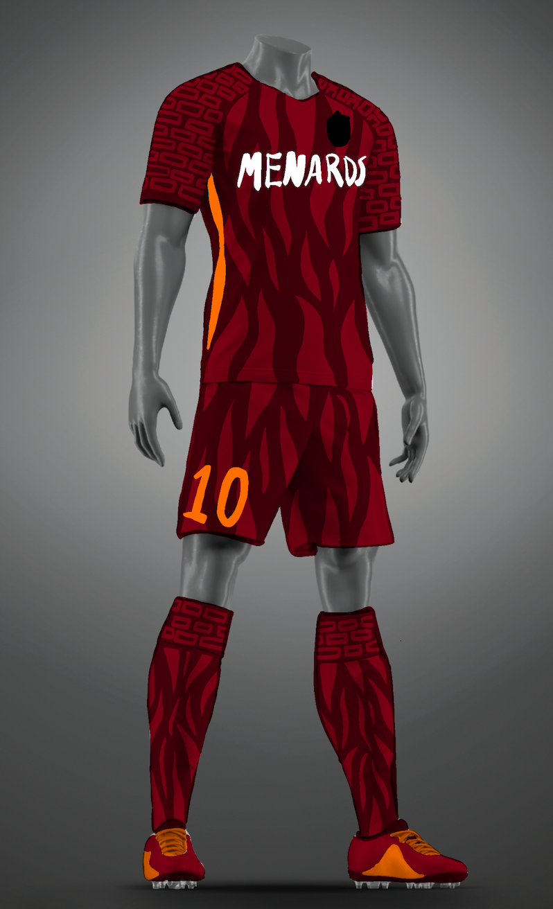

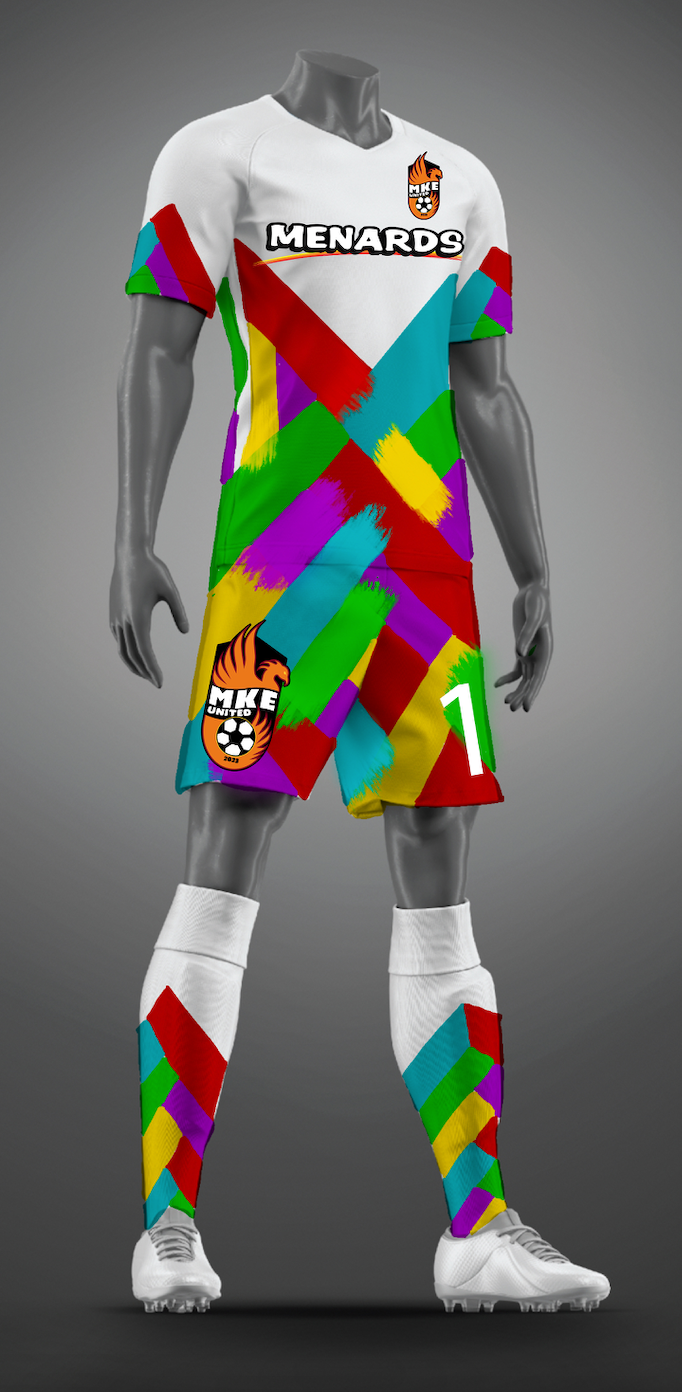
Final Kit Designs

Action Kit Mockup